Logo Design

Designing logos that feel like they were always yours.

A logo conveys identity, trust, and a first impression in a single mark. Here's that thinking applied across categories: a real local business, a national youth program, and self-initiated concept work.

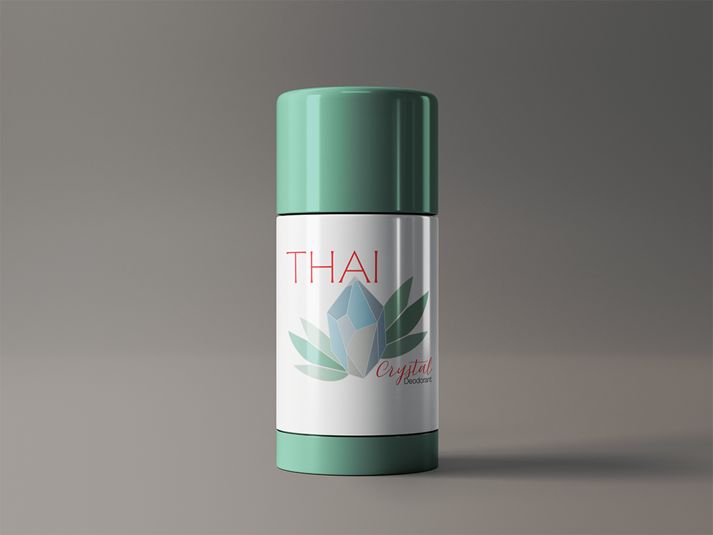
Thai Crystal

Logo Concept · Packaging Mark · Redesign

Self-initiated concept redesign. Thai Crystal's original packaging didn't match the product, so this mark reimagines it: a faceted crystal with a natural leaf accent, carrying over the brand's signature red. The logo carries the concept, shown here applied to updated packaging.


Teal square bag with a white cloud graphic and black outline on gray fabric.
Mint-green Thai lotion bottle with a silver label on a gray background

Cloud Nest Bedding

Logo · Bedding Brand · Concept

Cloud Nest Bedding is a fictional brand built around softness and sleep. An owl felt right immediately: quiet, nocturnal, tied to rest. Drawn in a rounded, pillow-like shape with an earthy palette, the mark reads calm and cozy at a glance, exactly what a bedding brand needs to say without a word of copy.
Black-and-white line drawing of an owl face with patterned wings and pointed eyes
Cream pillow with a sleeping bear logo and
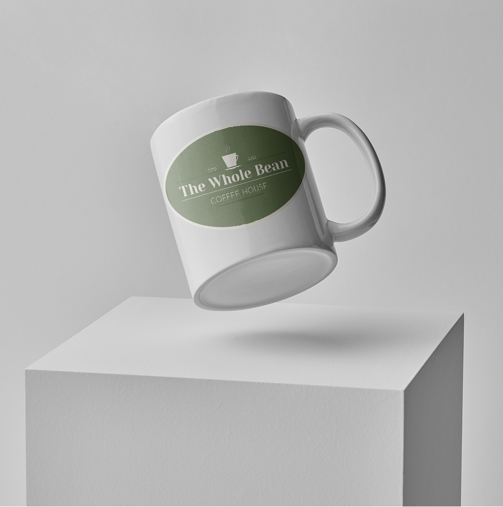
White mug with green “Tree Whole Bean” label floating above a white pedestal.

The Whole Bean

Logo · Coffee Brand · Concept

The Whole Bean needed a mark that read warm and community-first without slipping into generic coffee-shop clichés. A simple cup icon paired with clean type keeps it approachable, while a badge, square, and wordmark version prove the mark holds up across formats, from a takeout cup to a storefront sign.

Black coffee cup logo with steam above the words “The Whole Bean Coffee House”
Floating black product boxes and a white stylus on a teal background

HWY68

Logo · Local Brand · Eatery

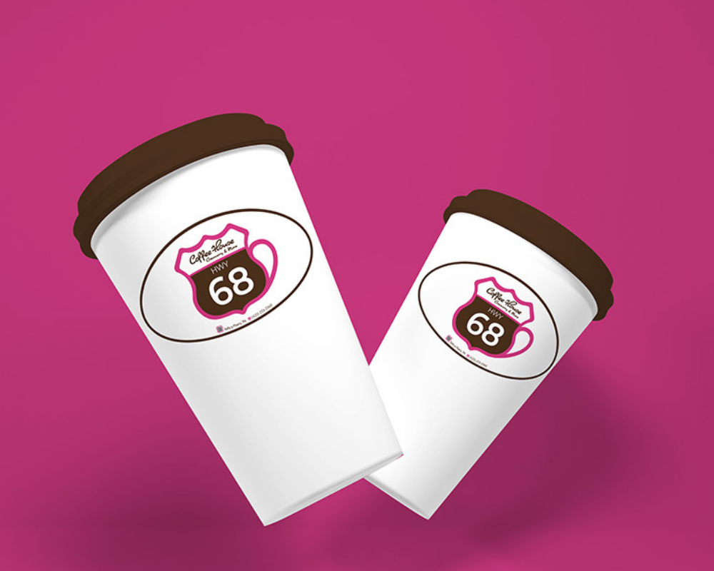
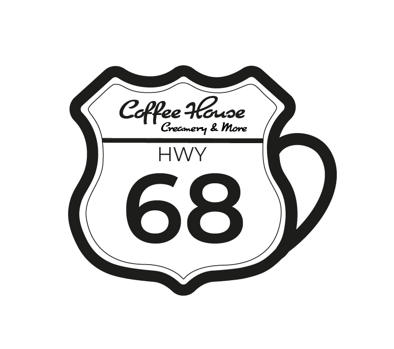
The HWY68 mark ties a local road sign, a coffee cup, and a real business together in one shape. Pink for visibility from the road, brown for coffee, black and white to keep it clean. Built as part of the full HWY68 branding and UX/UI project.


Coffee House Bakery & More sign in a white shield shape with black outline, marked Hwy 68