

Web Design
Structure first, screen second. Every layout from scratch. Yes, I speak code too.
Before I open Figma, I think in structure: hierarchy, flow, how a page holds up across screen sizes. These projects were coded by hand in HTML and CSS, staged in Dreamweaver, and pushed further in Webflow, so the eye for layout comes backed by an understanding of how a page actually gets built. These sites are no longer live. The code, the build, and the decisions behind them were mine.
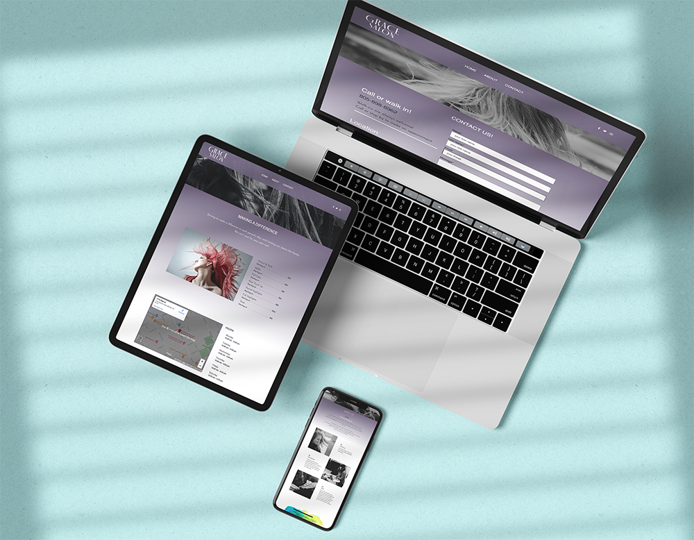
Grace Salon
HTML/CSS · Responsive · Final Project
A fictional salon website coded from scratch as my final college web design project, built without step-by-step guidance and shaped by my understanding as a salon owner of service pages, trust, and client flow.
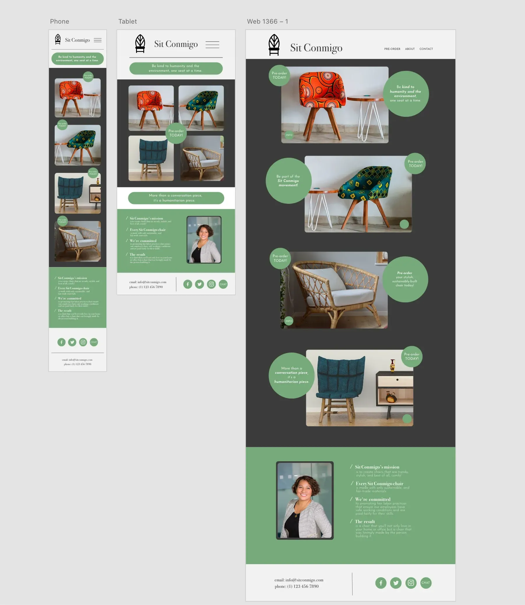
Sit Conmigo
Figma · Mobile-First · Responsive
Sit Conmigo needed a full redesign that worked across tablet and phone, not just desktop. It's also where I started learning Figma, carrying the same mobile-first logic from code into a design tool for the first time.
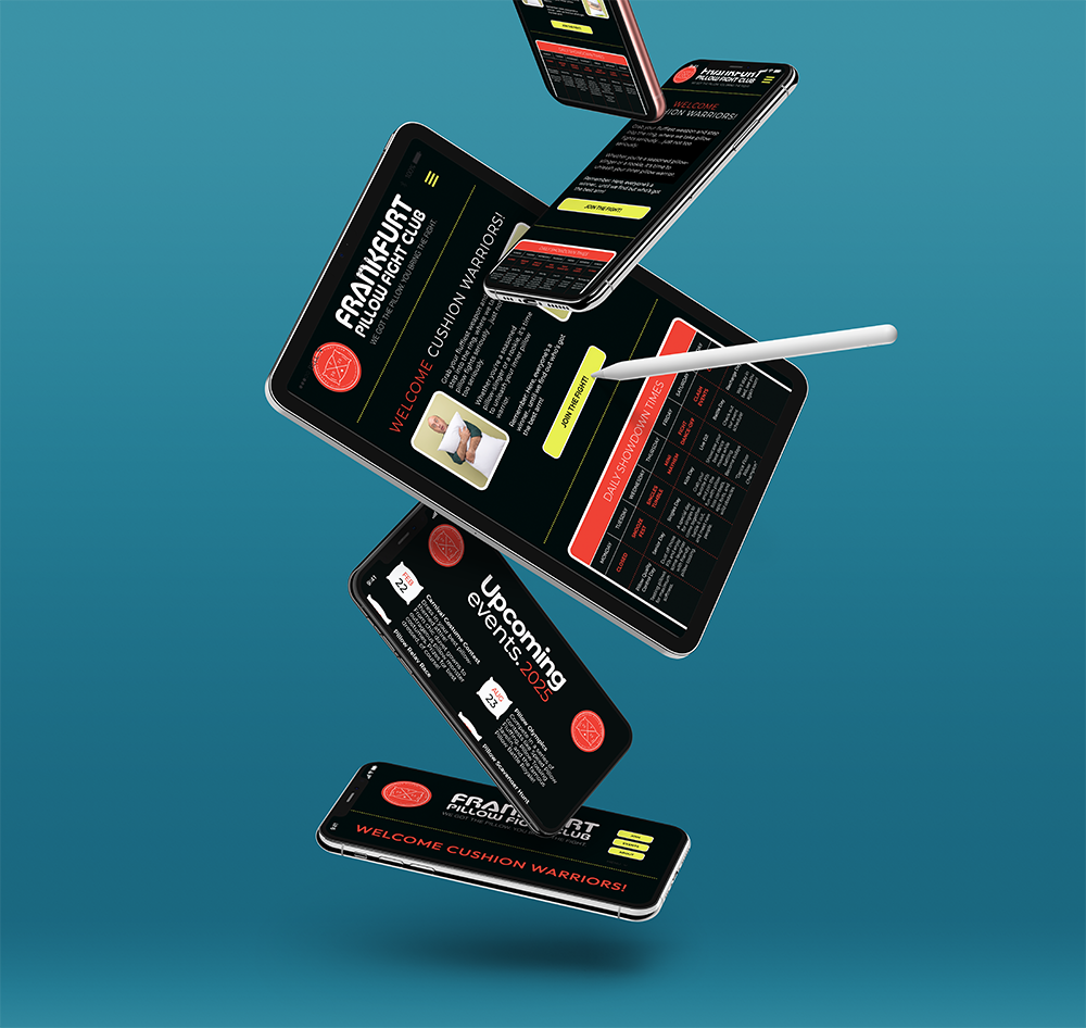
Frankfurt Pillow Fight Club
Webflow · Concept · Logos
As part of a Webflow project, I designed this site along with a full logo exploration for the fictional Frankfurt Pillow Fight Club, a randomly generated brief I used to push further into Webflow: building out a complete visual system, not just a page.
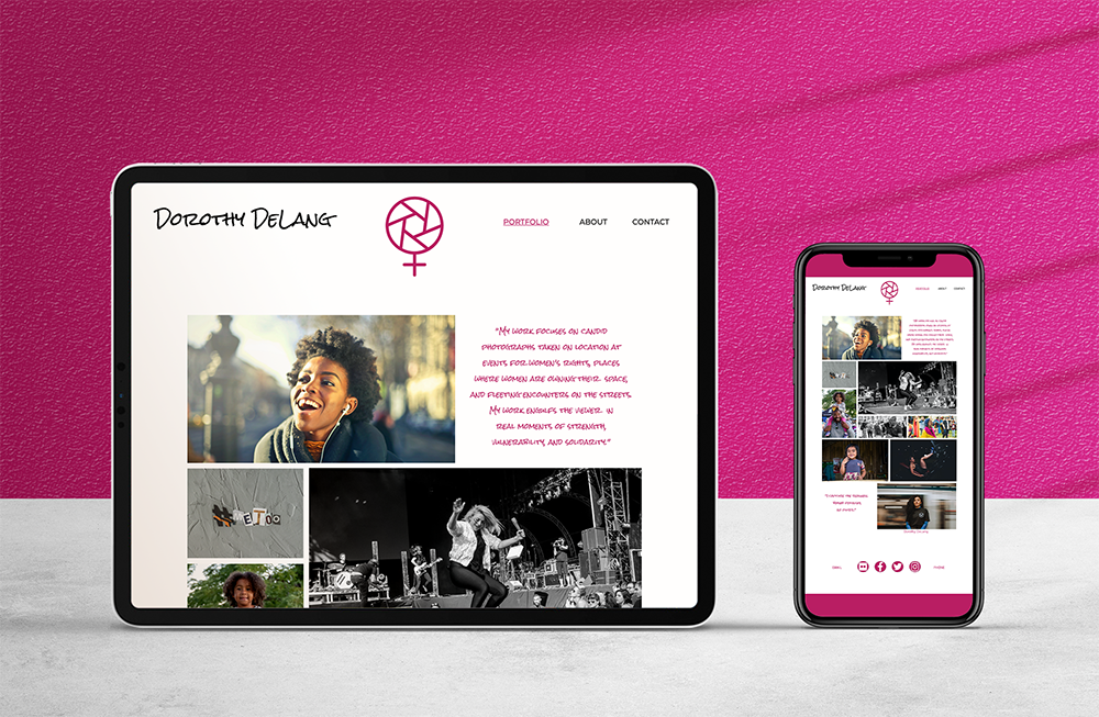
Dorothy DeLang
HTML/CSS · One-Page · Photo Site
Photography sites live or die on hierarchy: what the eye lands on first, what it skips. This site was coded from scratch to put the images in control, with a simple structure underneath holding it together. Built during web design coursework to practice structure, hierarchy, and responsive page flow.