Brand Identity System
Built Like a Brand. Feels Like the Block.
The Whole Bean
Watch the Case Study Walkthrough
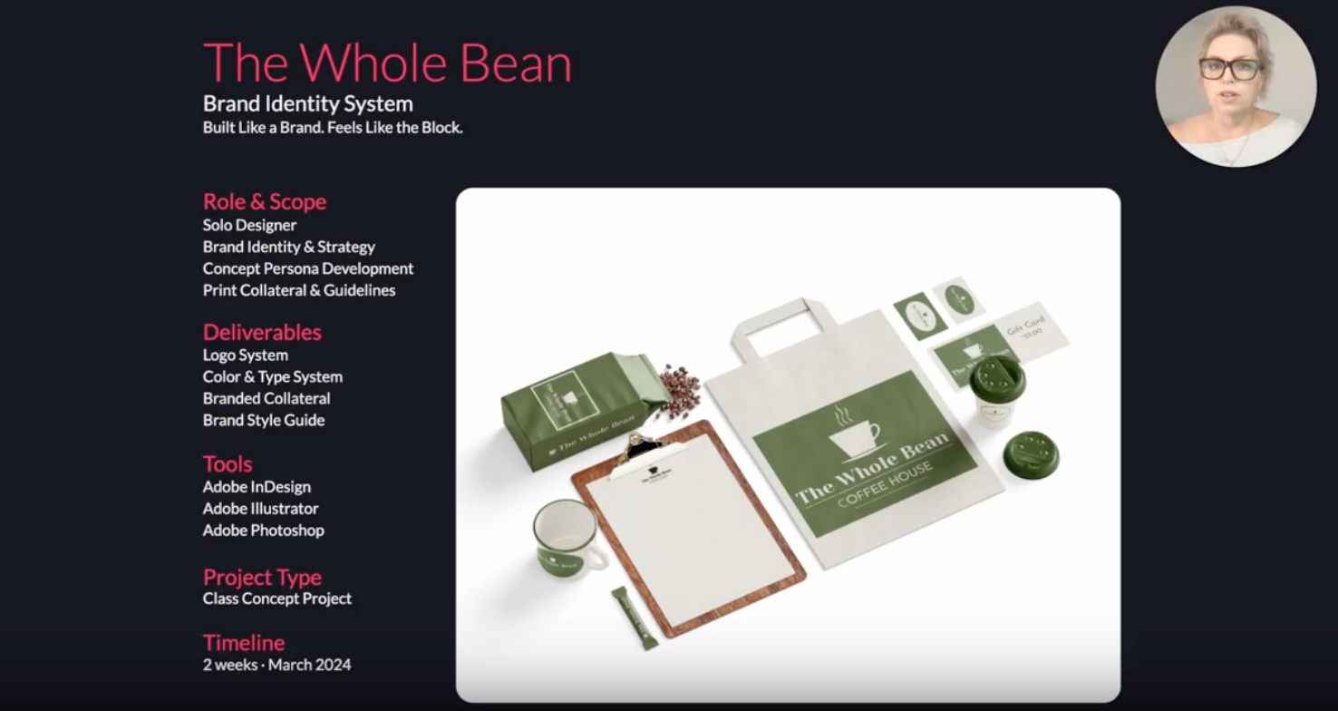
Role & Scope
Solo Designer
Brand Identity & Strategy
Concept Persona Development
Print Collateral & Guidelines
Deliverables
Logo System
Color & Type System
Branded Collateral
Brand Style Guide
Tools
Adobe InDesign
Adobe Illustrator
Adobe Photoshop
Project Type
Class Concept Project
Timeline
2 weeks
The 20-Second Blueprint
01 The Identity
I built the full identity system: logo, color, type, and icons. The brief was a concept only, with no existing brand and no client to react to.
02 The Collateral
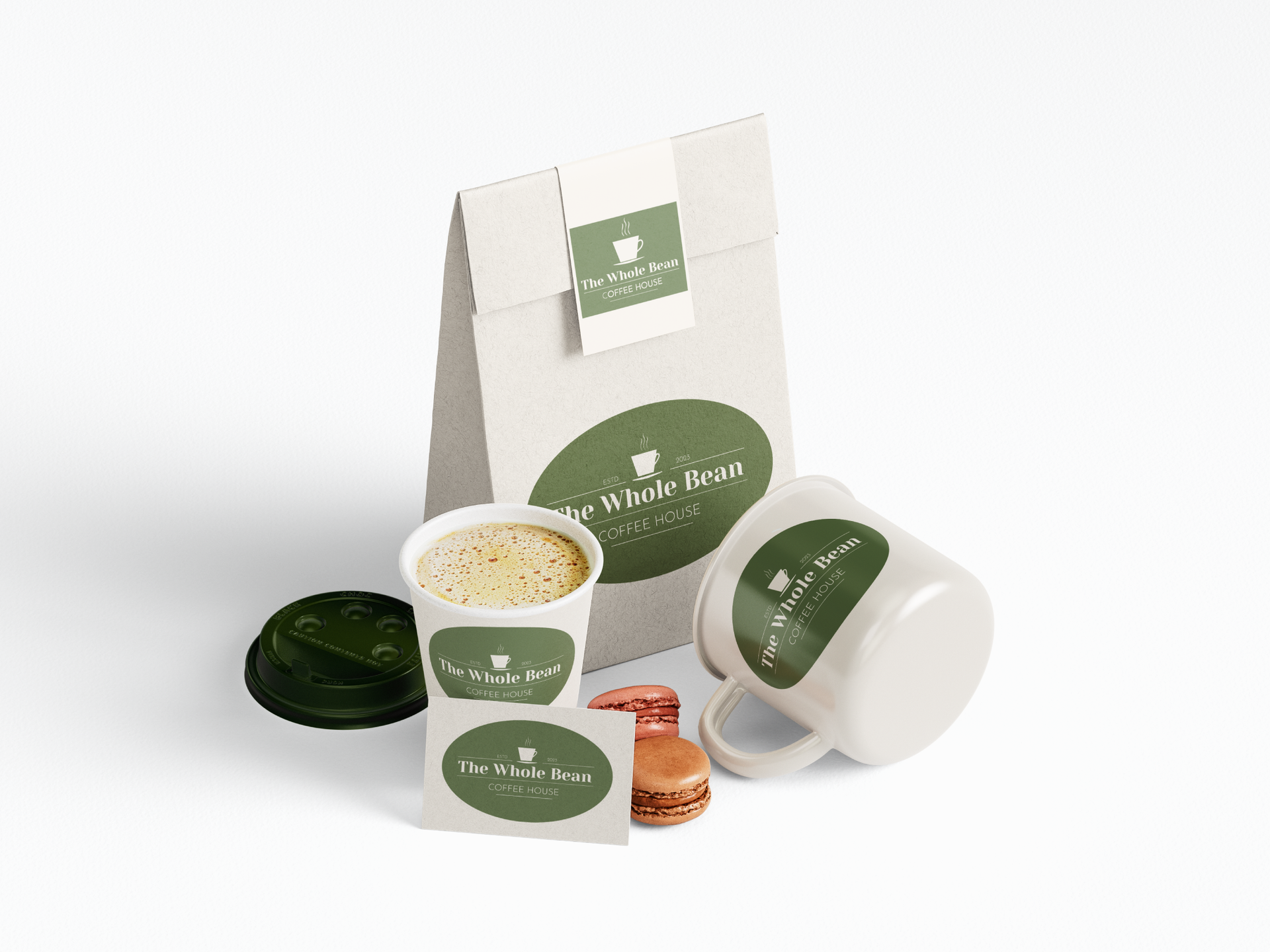
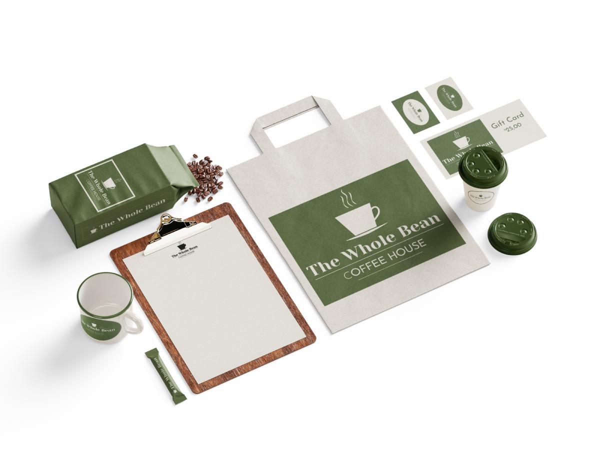
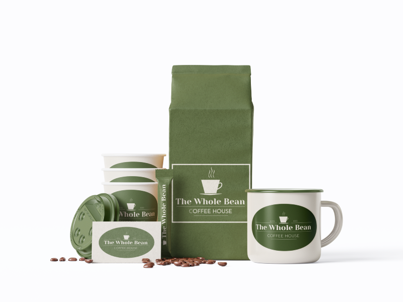
I applied it across cards, packaging, takeaway collateral, and marketing mockups to test it as a working system, not just a logo.
03 The Guide
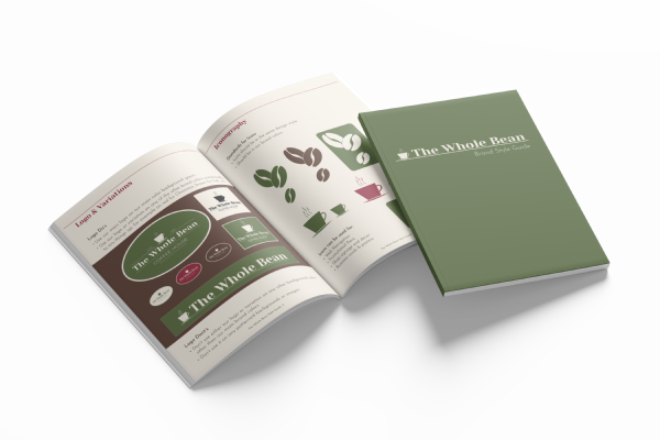
I documented every rule: logo use, color, type, and imagery, so the system could be reproduced consistently by anyone who picks it up.
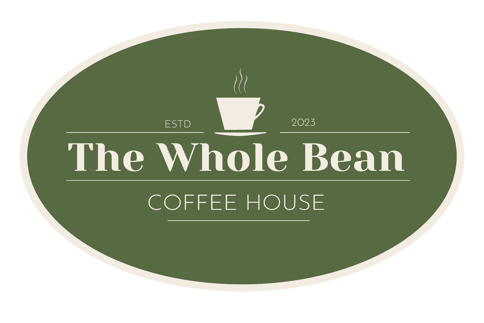


Grounds Up
The Whole Bean started with a name and a brief, not a business. I was asked to build a complete identity for a fictional neighborhood coffeehouse: a system that could hold up on a cup, a card, a sign, and a printed guide - consistent no matter who applied it. That meant building a system grounded enough to justify every decision without a client in the room.
Brewing Community Connections. One Cup at a Time
The plan to build The Whole Bean brand in three moves.
The System
Concept Scope
No existing brand, no real client, just a written brief.
System Simplicity
Simple enough that someone with no design background could still use it right.
Solo Timeline
Two weeks, start to finished style guide.
Real limits: a tight budget, tricky materials, and two weeks to do it solo.
The Constraints
High-Contrast
Easy to read on rough kraft paper, dark backgrounds, or tiny print.
Scalable
One system across signage, cups, coffee bags, and social.
Community-Grounded
Feels like a local staple, not a chain.
Build one visual identity that works everywhere: packaging, print, and screen.
The Brief
Establish the Visual Anchor
Lock the logo, colors, and fonts.
Test Across Surfaces: Put it on cups, bags, carriers, and loyalty cards.
Document for Handoff
Put the rules in one style guide anyone can follow.
One System, Every Surface
Recognition
One mark, documented clearly enough that the next person who touches it uses it the same way.
Reuse
Colors, type, and imagery decisions captured in one guide so nothing has to be reinvented for the next asset.
Small-Business Fit
Built for a business that won't always have the same designer in the room.
Clarity
Every choice is named and explained, not just shown.
The concept centered on a couple who weren't selling coffee. Their idea: a café where the neighborhood actually gathers- ages 30 to 60, parents, remote workers, and retirees in the same room. My job was to build an identity warm enough to feel like home and sharp enough to signal quality, then hand it off in a style guide they could run without me. That meant full-scale from day one: packaging, collateral, merch, and seasonal materials, because a brand built for recognition has to be ready before the room fills up.
Working the Blend
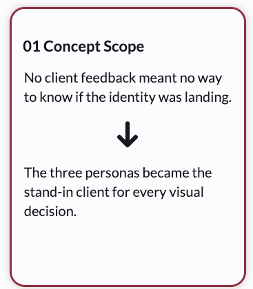
01 Concept Scope
No client feedback meant no way to know if the identity was landing.

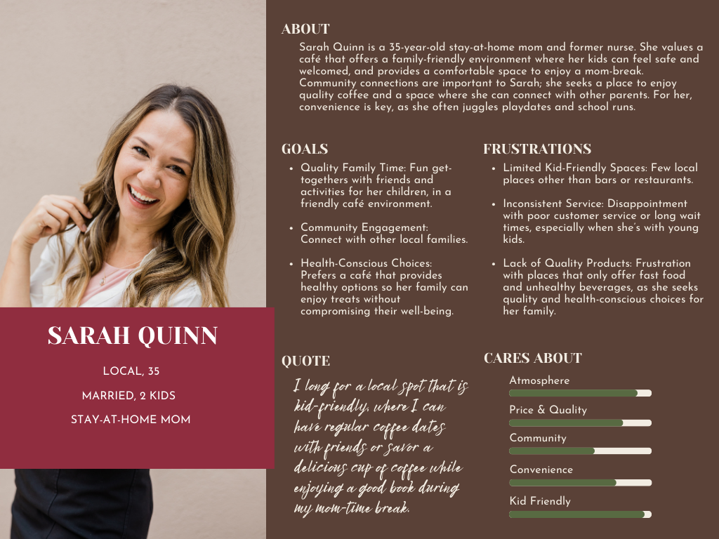
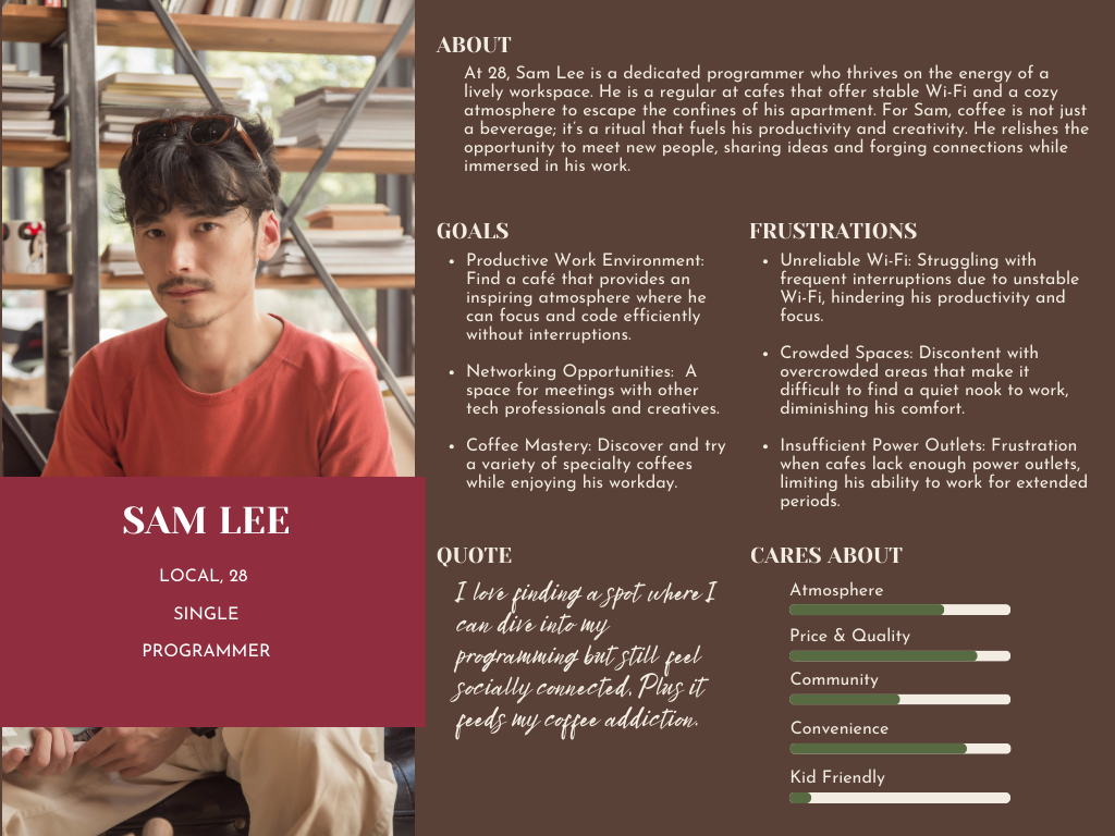
The three personas became the stand-in client for every visual decision.
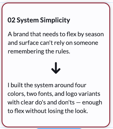
02 System Simplicity
A brand that needs to flex by season and surface can't rely on someone remembering the rules.
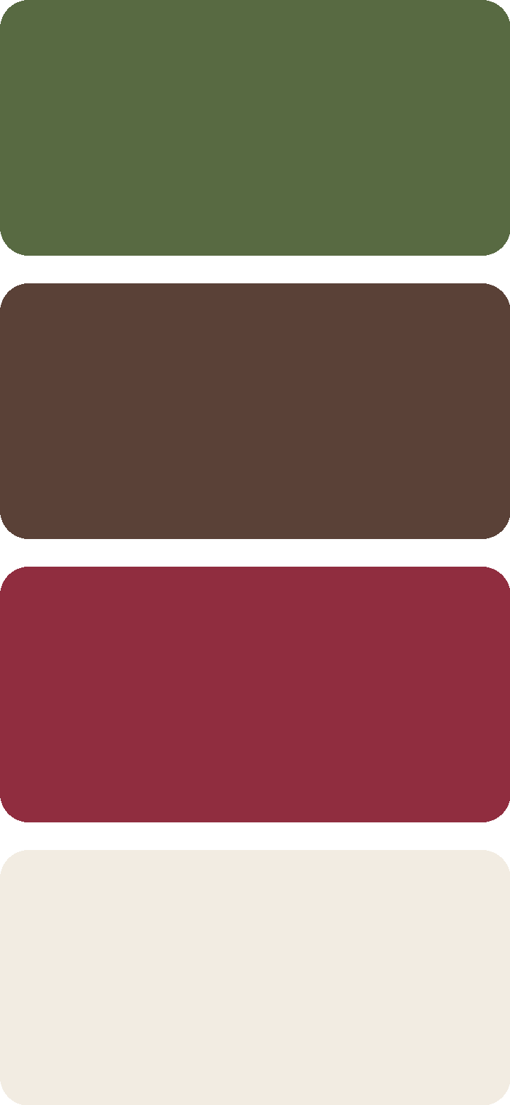
I built the system around four colors, two fonts, and logo variants with clear do's and don'ts — enough to flex without losing the look.
03 Solo Timeline
Two weeks meant the system had to work without me from day one.
I built logo variants, packaging shapes, and a reusable image base they could mix and match across products and seasons on their own.
The First Pour
Who's Pulling Up a Chair
No real client meant the personas had to carry that job, and every visual decision ran through them.
Scouting the Block
There were no direct competitors in the immediate area, which didn't make the job easier. It made it different.
01 No Local Benchmark
Without an existing coffeehouse nearby, the brand had to define what quality looks like in this neighborhood from scratch.
02 No Comparison Pressure
Customers wouldn't be choosing between options, so the brand had to give them a reason to stop, not a reason to choose The Whole Bean over someone else.
03 First Mover Visibility
Being first meant the physical brand had to work harder. Recognition and presence had to be built before the foot traffic could follow.
Reading the Room
The brand had one job: feel like home to everyone from 30 to 60. Welcoming. Down-to-earth. Genuine. High-quality. Those four words drove every decision I made from there.
The Café
What kind of place is this?

A neighborhood coffeehouse where the community actually gathers, not just passes through.
The Reality
What had to work in real life?
A brand that held up across packaging, print, and social from day one, with no launch history to lean on.
The Customers
What do people need to grasp fast?
That this is the kind of place worth making a habit.


The Look That Sticks
Rooted in the Product
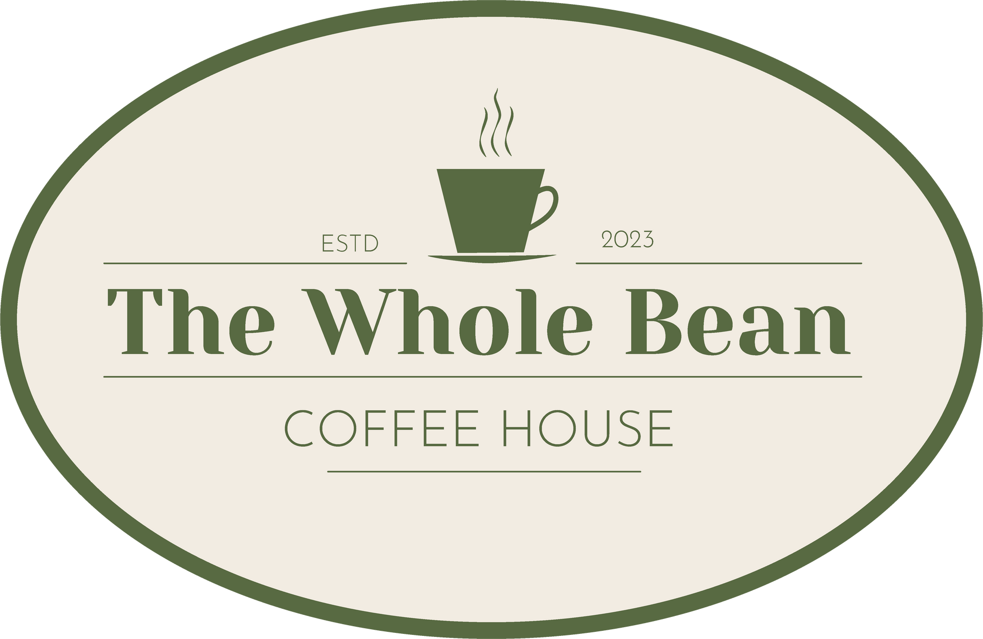
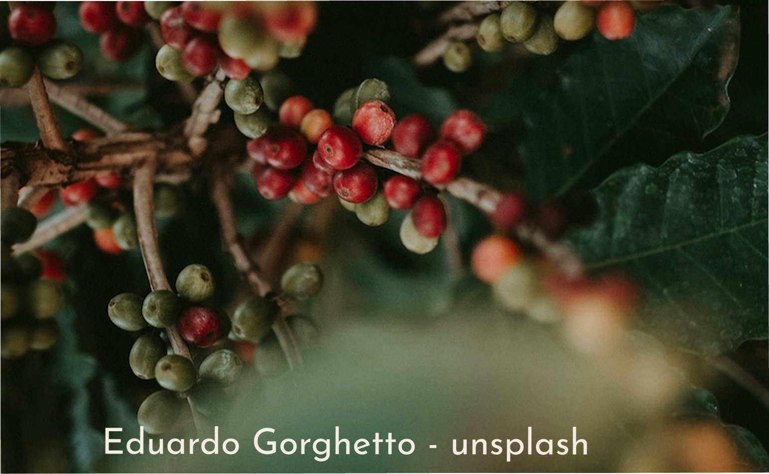
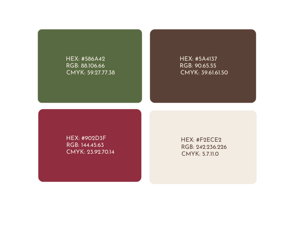
The green came from the coffee bean flower imagery I built into the brand. Earthy, organic, and specific enough to signal quality without looking corporate.
Grounded in Warmth
The roasted brown connects the palette directly to the product, coffee, comfort, and the feel of the space.
Quality in the Details
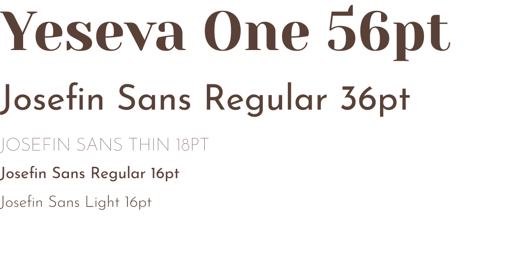
The serif brought elegance and history to the name; the sans-serif kept body copy clean and legible. Friendly but not casual.
Built for Flexibility
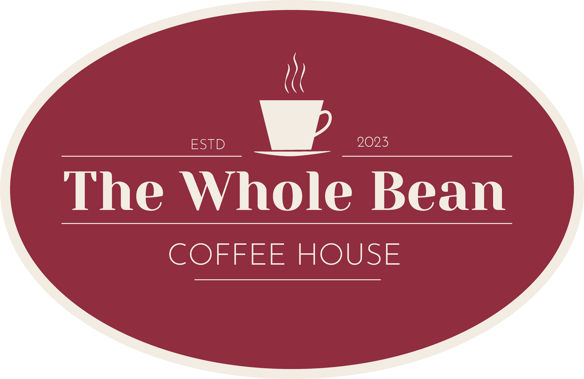
Multiple color versions, not just multiple uses. The system was built to stretch across seasonal campaigns, product lines, and merch without the brand falling apart.

Built to Be Used
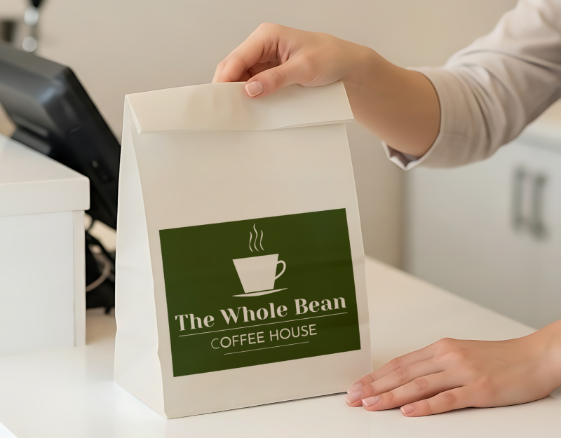
The brand had to do more than look good in a style guide. Every piece was built to work on the actual surfaces the owners would use from day one: packaging, cards, takeaway collateral, and marketing materials that stayed consistent without needing a designer to hold it together.
Ready to Hand Off
I built the guide so the brand could keep going without me.
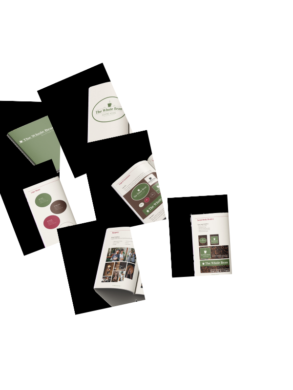
Every decision is documented: what to use, how to use it, and what to avoid.
01 Color Codes Locked
Every color is named with hex, RGB, and CMYK values so the palette prints and displays consistently across every material.
02 Type Scale Set
Font choices, sizes, and use cases are documented so the brand reads the same whether it's a social header or a paper menu.
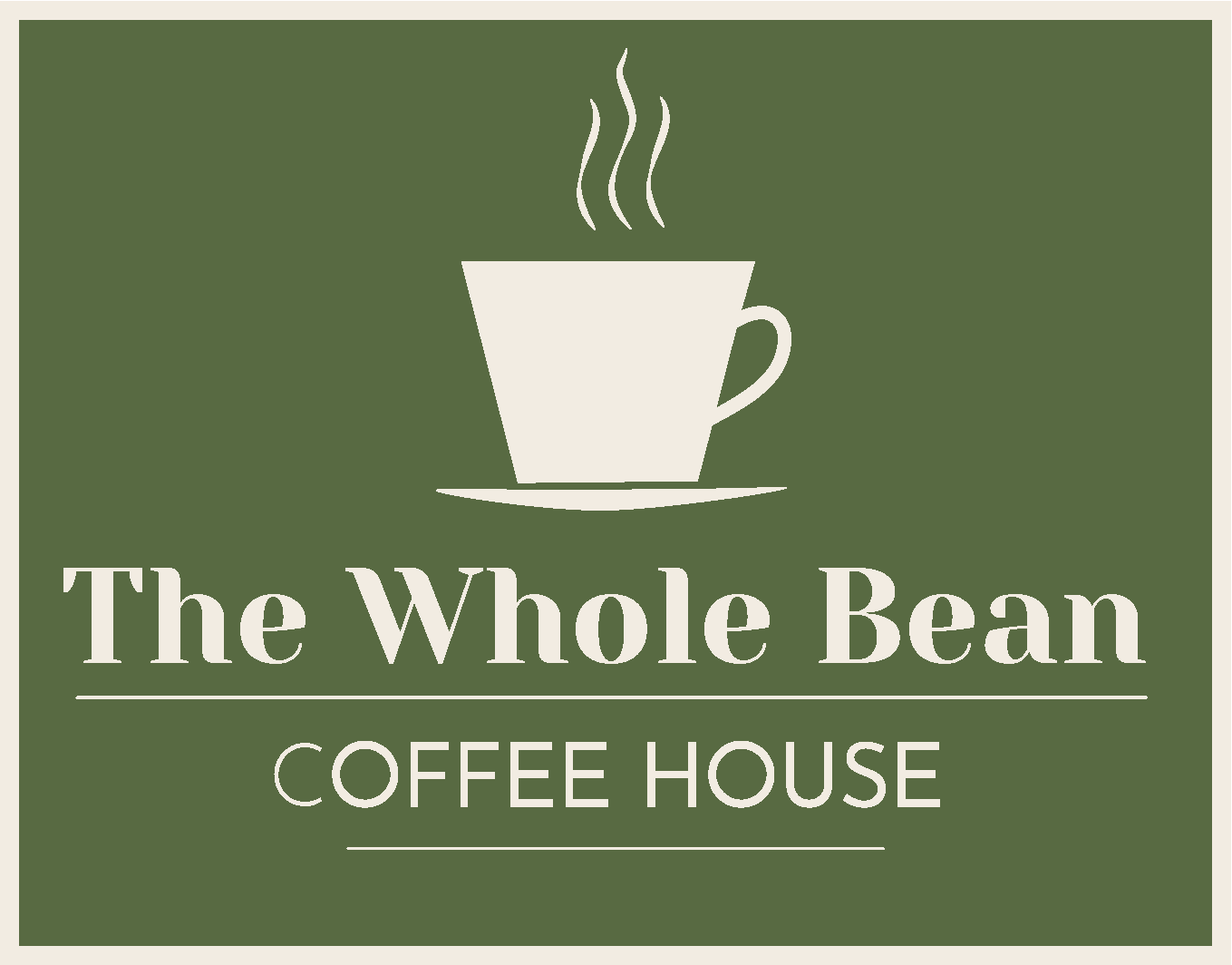
03 Logo Rules Defined
Do's and don'ts are spelled out so the mark stays consistent no matter who applies it or what surface it lands on.
Still Brewing
What I learned
Building from a written brief with no client to react to confirmed that research has to hold the weight a real client conversation usually carries. Every decision traced back to the personas. The other lesson was about the guide itself: documenting the system as you build it, not after, is the only way to hand off something someone can actually use.
If It Went Live
A concept brief gets you to the guide. Real life tests everything after it.
This is what I would test:
- If the brand colors hold true when a new vendor runs the next print job without a color profile from me.
- How well the style guide holds up when someone outside the project uses it to produce a seasonal promotion on their own.
- And whether the three personas actually reflect who walks through the door once the café is open.