


HWY68
Brand Identity → Mobile Concept.
Brand identity and mobile UX for a working eatery.
Most designers research the owner's pressure. I've been that owner.
Watch the Case Study Walkthrough
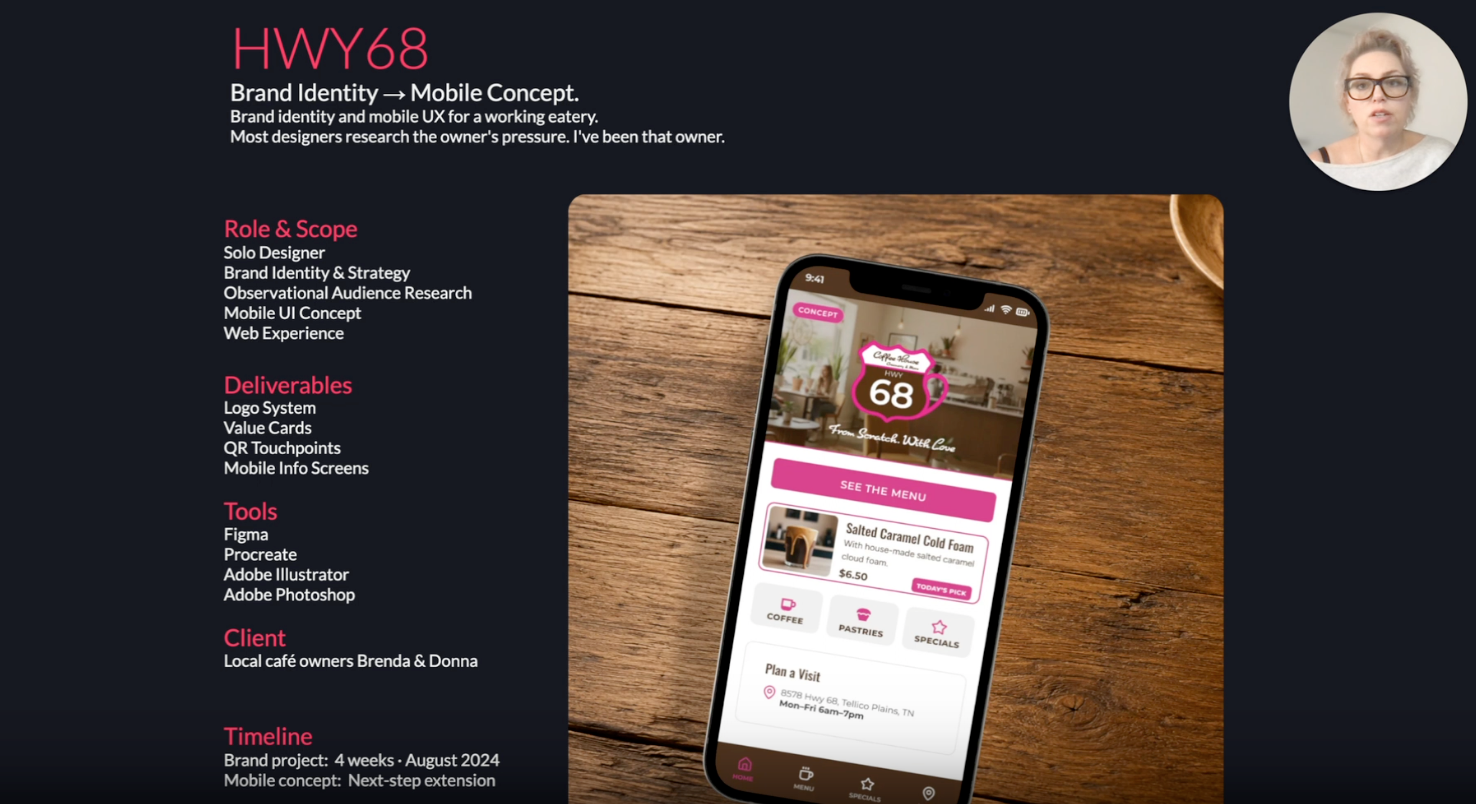
Role & Scope
Solo Designer
Brand Identity & Strategy
Observational Audience Research
Mobile UI Concept
Web Experience
Deliverables
Logo System
Value Cards
QR Touchpoints
Mobile Info Screens
Tools
Figma
Procreate
Adobe Illustrator
Adobe Photoshop
Client
Local café owners
Timeline
Brand project: 4 weeks
Mobile concept: Next-step extension
The 20-Second Blueprint
01 From Scratch
No brand, no web presence, nothing to build on. The identity came first, on purpose. The mobile concept was scoped as a separate phase, not bundled in. The sequencing was deliberate: prove the brand system works, then extend it.
02 Road-Tested
Built for the conditions a roadside café actually operates in. A color that catches from the road. A mark that holds on a card, a cup, a counter sign. A QR code that works in one tap. Nothing in this system was designed for a portfolio — it was designed for daily use.
03 Next Step
The four-screen structure came from UX judgment, not client input. The owners had a clear sense of their business. They didn't have a frame for mobile architecture. That part was mine.
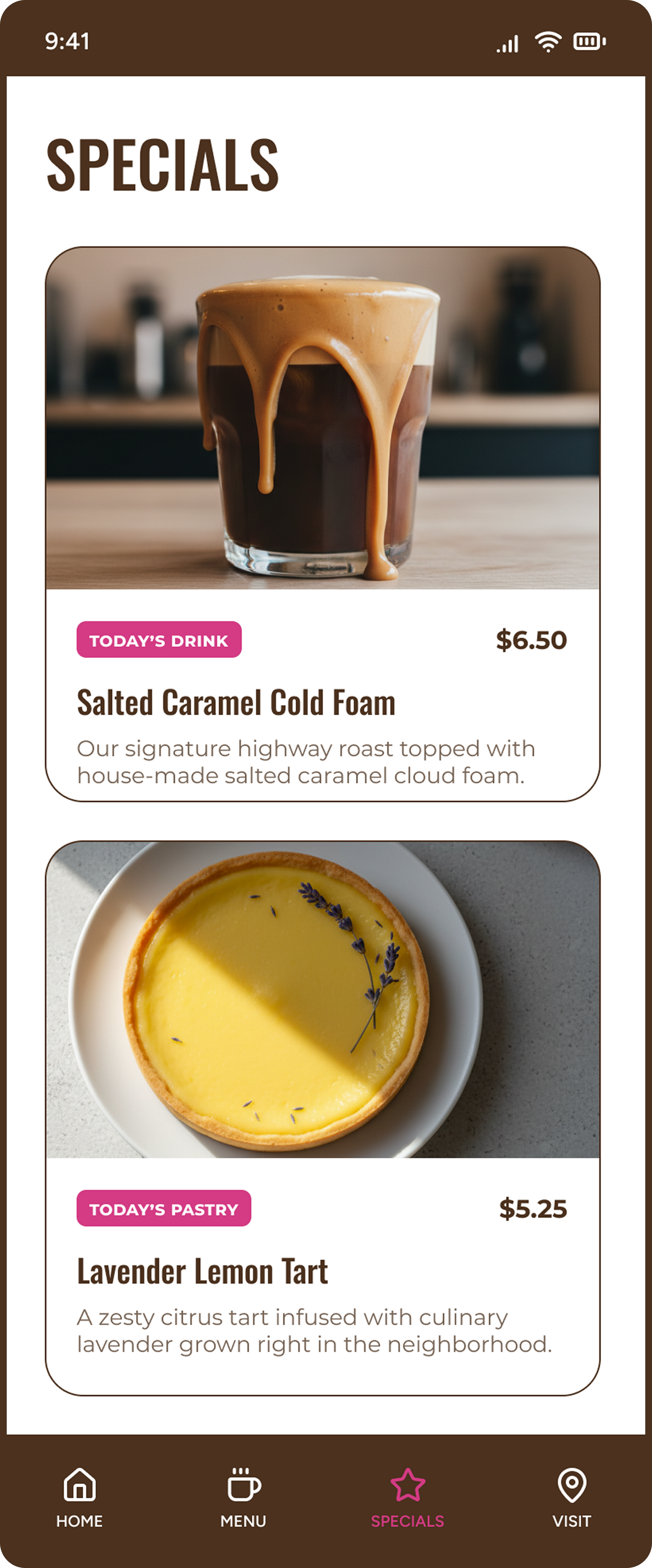
Specials got its own screen because that's what brought regulars back. The café already ran on daily specials — posted to Facebook, gone the next day. The design gave that habit a permanent, findable home instead of a disappearing feed post.
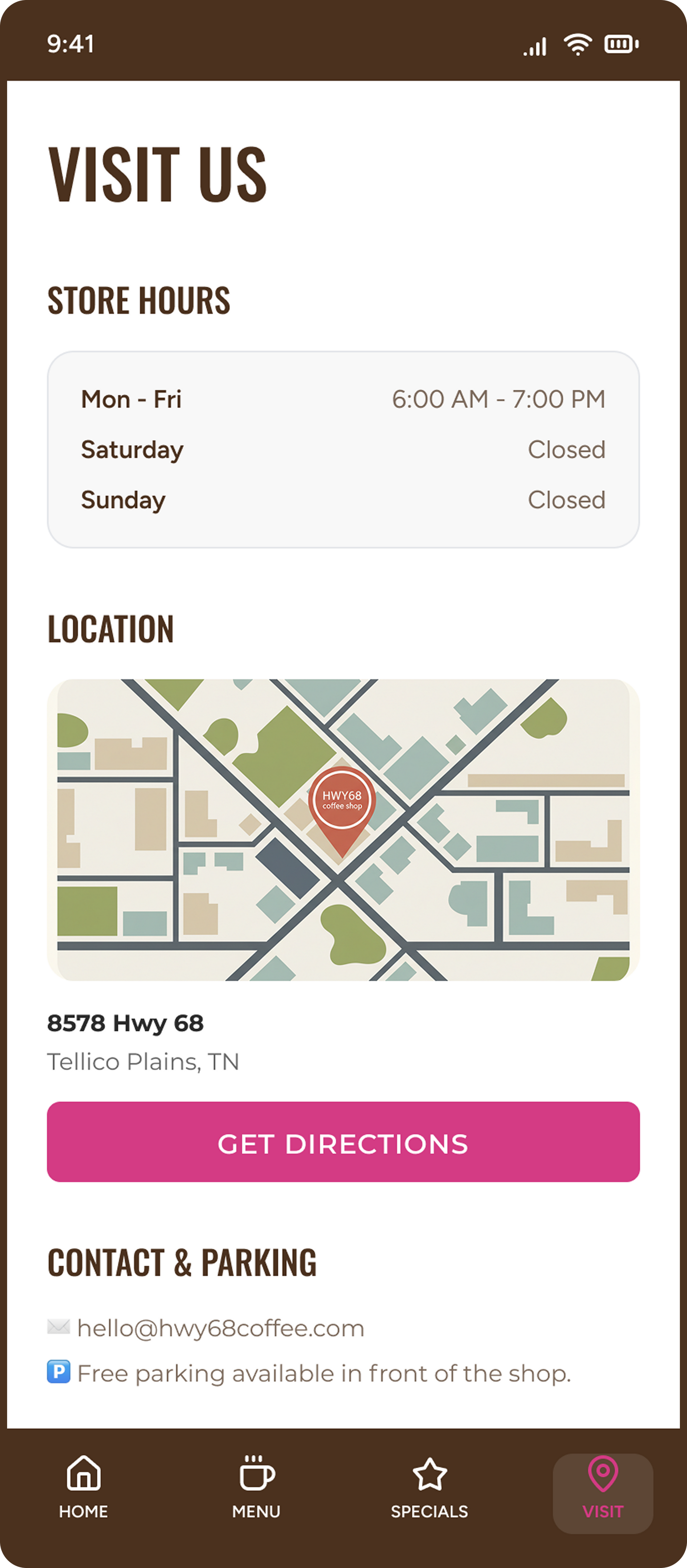
Visit Details got its own screen because a highway address doesn't orient anyone. HWY 68 runs through multiple towns. Customers needed a map, not just a number.
The Brief
Build one visual system that works everywhere, from a sign read at 55 mph to a phone screen in your hand.
High-Contrast
Readable at speed or on a small screen.
Scalable
One system across sign, card, QR touchpoint, and mobile UI.
Community-Grounded
Local and independent, not chain-café generic.
Action-Oriented
Built to help people decide to stop.
The Constraints
Real café, real limits: changing info, small budget, and tools that had to stay easy to maintain.
- A working café, not a blank-slate concept.
- A menu and hours that change.
- Owners who needed simple, low-maintenance tools.
- A small-business budget.
- Two ways in: roadside discovery and local foot traffic.
- Customers decide fast, often in seconds.
The Route
The plan to get HWY68 from roadside to phone screen. Three moves, in order.
Establish the Visual Anchor
A logo, color, and type system strong enough for a roadside sign and a phone screen.
Bridge Physical to Digital
Carry signage, value cards, and QR touchpoints into a mobile-first structure.
Optimize for Discovery
Put the decision info first: menu, hours, specials, location, visit details.
The Starting Line
HWY68 had loyal locals and roadside traffic, but no clear brand or online presence. New customers couldn't find the café or check the menu, hours, or specials before pulling in. The work started as a brand identity and marketing system. The mobile concept is the next-step extension, built to get that info into a customer's hand before they arrive.

One System, Every Surface
What Changed
Recognition
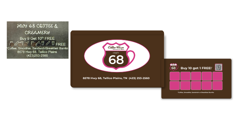
There was no prior brand to clean up. No door sign, no online presence, no logo file somewhere in a drawer. The one printed asset that existed — a hole-punch loyalty card from a local copy shop — physically damaged itself when it was used.
This wasn't a rebrand. It was a zero-to-one build. What changed wasn't consistency. It was existence.
Reuse
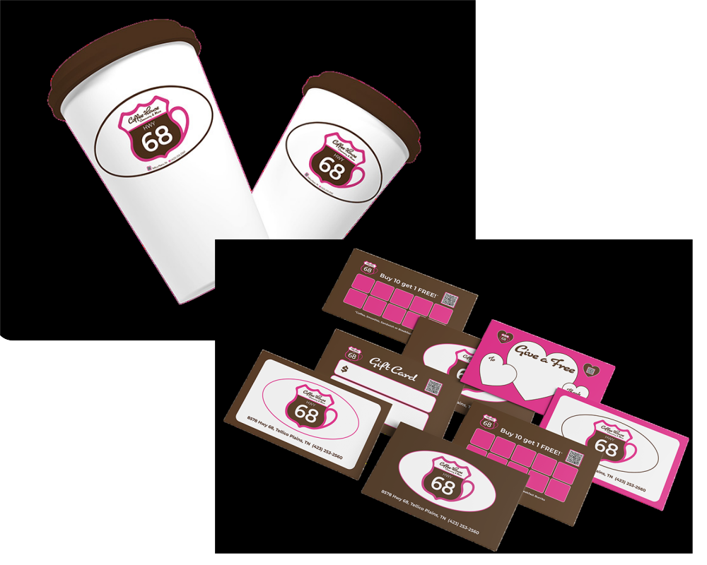
The core asset is one flexible oval mark — cup graphic, name, location, contact. Designed specifically to reproduce as a vinyl sticker. That was a cost decision, not a design shortcut. Custom-printed cups and fabricated signage cost multiples of the sticker alternative. I pulled actual vendor pricing and gave the owners a comparison: cheapest tier, mid tier, full build. They could start immediately, without waiting to afford the full version. The system was designed to grow with their budget. Not after it.
Clarity
Before this work, no public place existed for basic business information. Hours, pricing, location- none of it was findable. A customer who wanted to know if the café was open had one option: drive there and check.
This system created the first designated home for that information. Not just on a screen, but on a card in a wallet, a QR code at the counter, a mobile screen before the turn-off.
Small-Business Fit
Restocking cards, stickers, and printed pieces was set up through a single platform, one click to reorder. The logo mark was built simple enough to apply by hand to a flyer, a sign, or a handwritten special without opening design software. The system had to run without me in the room. It does.
I started with the eatery's real limits: a small budget, changing menu and hours, owners new to tech, and customers deciding in seconds. I recognized every one of those constraints. I've run a business on exactly that margin. So the work was less about how it looked and more about whether they could keep it running after I left.
Working the Limits

Every material choice had a cost justification. If something looked right but cost more than the alternative without a clear functional reason, it didn't make the cut. This work was volunteered at full quality. Budget was the parameter, not the excuse. A reusable asset system, not a new build for every piece.
01 Small Budget
Every decision had to stretch the budget.
Before any designed piece existed, the most urgent problem was more basic than visibility. A person standing outside had no way to find out anything about the business: no link, no sign, nothing.
The first deliverable wasn't a design asset. It was a laminated page in the café's chosen pink, with a QR code linking directly to their existing Facebook page. Window and register, same day. Close the gap first. Design after.
The full brand system came later. That page stayed exactly as it was through closing.
02 No Visibility
Barely visible from the highway, no system to bring locals back.
Simple wasn't a fallback from something more ambitious. No app was ever proposed — not because the budget ruled it out, but because it would have failed the week after handoff. Two non-technical owners running a full café don't have a system for maintaining software. That was the read from day one, not a conclusion reached after trying something harder.
Print-and-reorder restocking. One logo mark manageable enough to hand-apply. Nothing that required design software to keep going.
03 Owner Upkeep
The owners run the café, not software.
The Route I Took
Reading the Map
Before the look came anything that shaped it. What kind of business is this, really? What would survive two non-technical owners and a small budget? What does a stranger need in the first few seconds? The look came after those answers. Not before.
From Scratch. With Love." is Brenda's phrase — the motto she gave the café before a designer was ever involved. The brand's job wasn't to say something new about the business. It was to carry what she was already saying and make sure it landed.
The Café
What kind of place is this?
Physical touchpoints first. A card, a sign, a QR code in the window- things you can hand directly to a person without a working website or a tech build behind them. Digital once the physical system proved it could hold. That wasn't a constraint. It was the right sequence for where this business actually was.
The Reality
What had to work in real life?
A car passing HWY 68 had nothing to work with. No way to know if the café was open, what it sold, or whether stopping was worth it. No reason to come back if they did.
The first visit needs one thing: fast proof that stopping is worth it before they pass the turn-off.
Return visit needs one thing: a real incentive. That's the stamp card's job — already built, already in the system.
The Customers
What do people need to grasp fast?
Who's Stopping In
These aren't template personas. One came from a direct interview. One came from a real daily customer Bee met in the café — habit and visit detail filled in by Brenda. The third came directly from Brenda's own market strategy: HWY 68 runs to the Cherohala Skyway, a major motorcycle corridor in East Tennessee, and capturing that seasonal traffic was already part of her plan.
Comes for: A friendly neighborhood stop, not a chain.
Needs:
Kid-comfortable space, fair prices, food she can trust.
Design Takeaway:
Brown palette and shield form signal neighborhood before she reads a word. Familiarity is the reason she comes back.
The Local Mom, 37
Homemaker & Homeschooler
Source: Direct interview
Comes for: Affordable home-cooked food and a table that expects him.
Needs:
Daily specials without hunting. Hours he can check before making the drive.
Design Takeaway:
Daily specials on the board, QR at the counter. The physical system gives him the reason to come back without needing to ask.
The Retired Regular, 73
Daily Regular
Met in person. Visit details from Brenda.
Comes for: A solid stop on a long route. Coffee, food, no reason to detour.
Needs: Fast answers — hours, what's good, where to park, how to find it.
Design Takeaway:
The flag catches them from the road. The card and QR give them what they need before they get back on the route.
The Biking Tourist, 50
Seasonal Tourist
Source: Brenda's stated target-market strategy
Scouting the Route
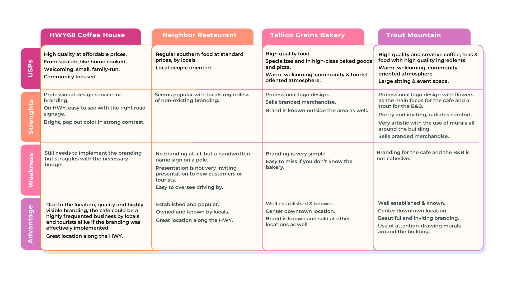
Nearby spots had recognition HWY68 didn't. I checked four local food businesses for visibility, brand clarity, and opportunities for HWY68 to win.
01 Visibility was the gap
HWY68 sat on a highway with the traffic to match, but didn't read as a brand at a glance.
02 Warmth was the edge
Its handmade, local feel already held up against bigger, better-known spots.
03 Brand consistency was the opening
Competitors won on recognition: murals, merch, prime locations. HWY68 needed one repeatable system to match it.
Working competitive analysis
The Look That Sticks
Working with Brenda and Donna meant working with two people who knew exactly what they wanted and couldn't always explain why. That's not a problem to manage. That's design information. The job was figuring out which instincts to follow, which to redirect, and which battles would cost more than they were worth. Not every tension got resolved. Some client choices got honored as-is — because they were right, or because replacing them would have meant swapping their personality for my preferences.
Warmth
Brown was the grounding choice, in coffee, in food, in the kind of place that's been there a while and isn't trying to convince you of anything. The alternative was a dark neutral that would have read as premium, finished, chain-adjacent.
Brown says neighborhood. That was the right read for a café that means it when it says: From Scratch. With Love.
The Shield
The logo form didn't start at a blank page. There was already a Route 68 highway sign on the café wall, a decoration, not a brand asset. I looked at it and saw a coffee cup. The shield became the mug.
Quick Recognition
Pink was Donna's call. It had a personal association I wasn't part of, and she wasn't asking for permission. What I could do was check whether it worked. It does. Pink reads at roadside speed in a way most café color palettes don't—it catches the eye before the driver has made a decision.
Her reason and my reason were different. The answer was the same.
Not this:
I selected pink for high-contrast roadside visibility.
But this:
The client chose it. It also works at 55 mph. Those two things don't need to be untangled.
Handmade Feel
Scope the script, not remove it. Brand marks and moments where personality matters more than precision — yes. Anywhere information has to land fast — no.
Donna's handwriting is how she talks to customers daily. Replacing it would have replaced her voice with my rules. The legibility risk was real and worth it.
Not this:
I recommended a more legible alternative.
But this:
I defined where the script could do its job, and kept it out of the jobs it couldn't do.
Built to Be Used
The brand had to do more than look good on paper. Each piece was built to do one job: get HWY68 noticed, bring people back, turn regulars into referrals, and keep the connection going after they leave.
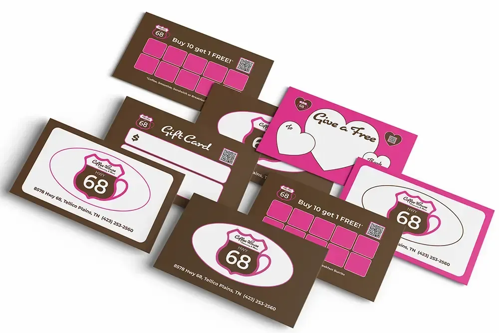
Cards over Digital
The choice wasn't made around the owners' tech comfort. That's a different decision, already made separately.
This one was about the customers. Rural East Tennessee regulars trust what they can hold over anything that lives on a screen. A push notification is noise.
Digital loyalty tools work well for the right audience. This wasn't that audience. Choosing a physical system here wasn't a workaround — it was an accurate read of what trust looks like to this specific customer base, in this specific place.
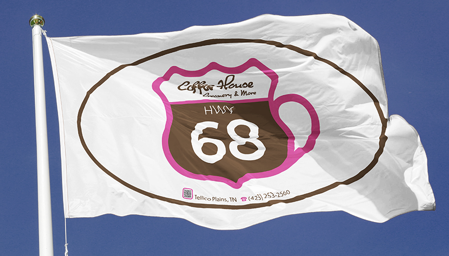
Seen From the Road
A two-lane rural highway rules out billboards. Custom elevated signage wasn't in the budget and wouldn't have fit the space. What catches a driver's eye at speed, cheaply, is motion.
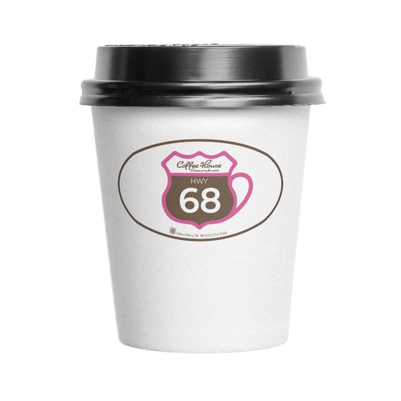
Brenda was already thinking about flags — built on her instinct, not around it. Pink and white, consistent. The cups do the same work at smaller scale: moving brand, no added cost.
Both choices follow the same rule: work with what moves, work with what's already there, and keep it consistent so every touchpoint confirms the same brand.
Easy to Keep Going
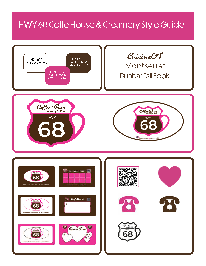
The owners needed a system they could keep using after the first design round. I documented the basics so that new pieces stay consistent without having to start from scratch.
01 Colors Documented
Future materials stay recognizable as HWY68.
02 Type Choices Set
The brand stays readable and consistent across pieces.
03 Assets Organized
Cards, signs, templates, and future mobile pieces all connect.
The Next Mile
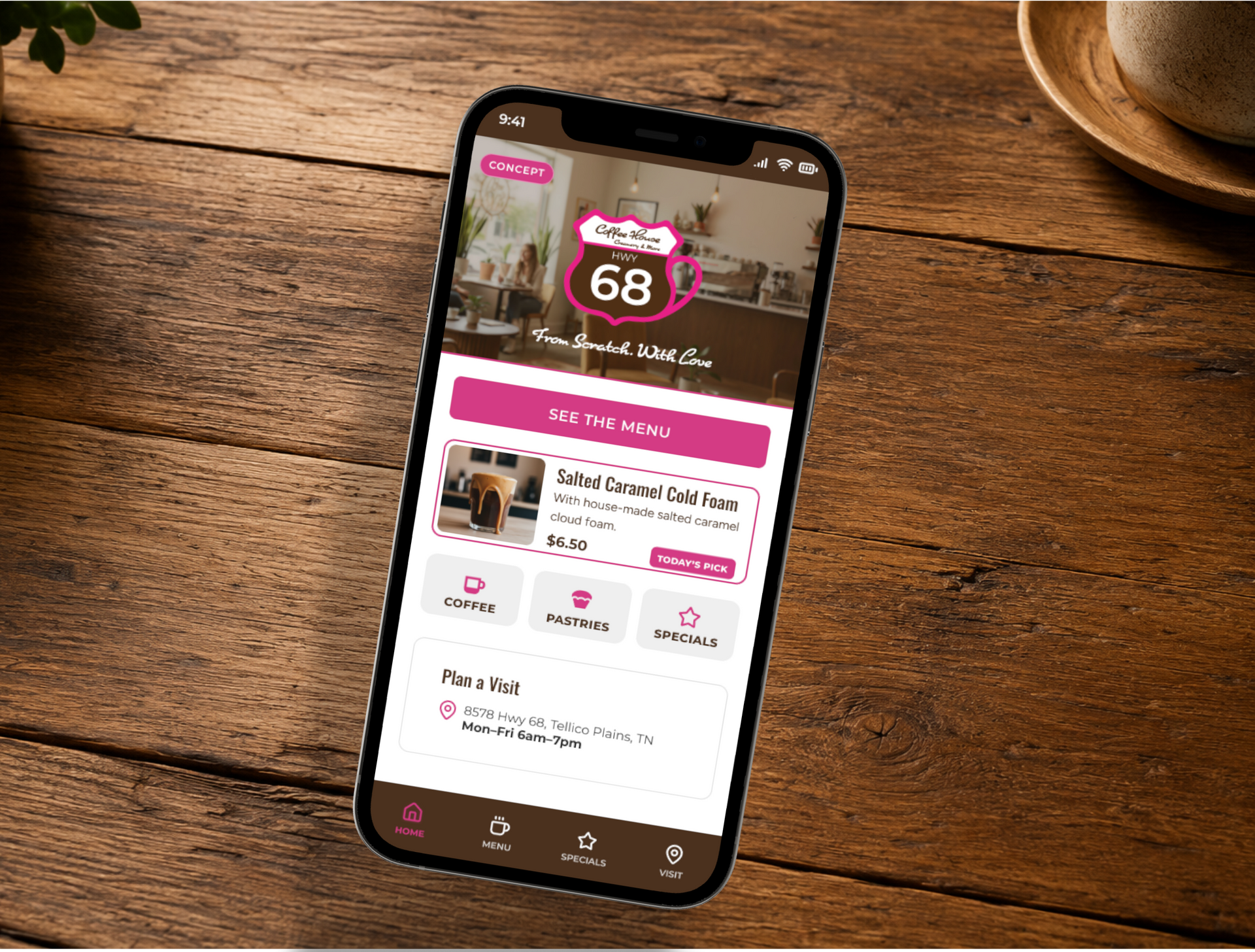
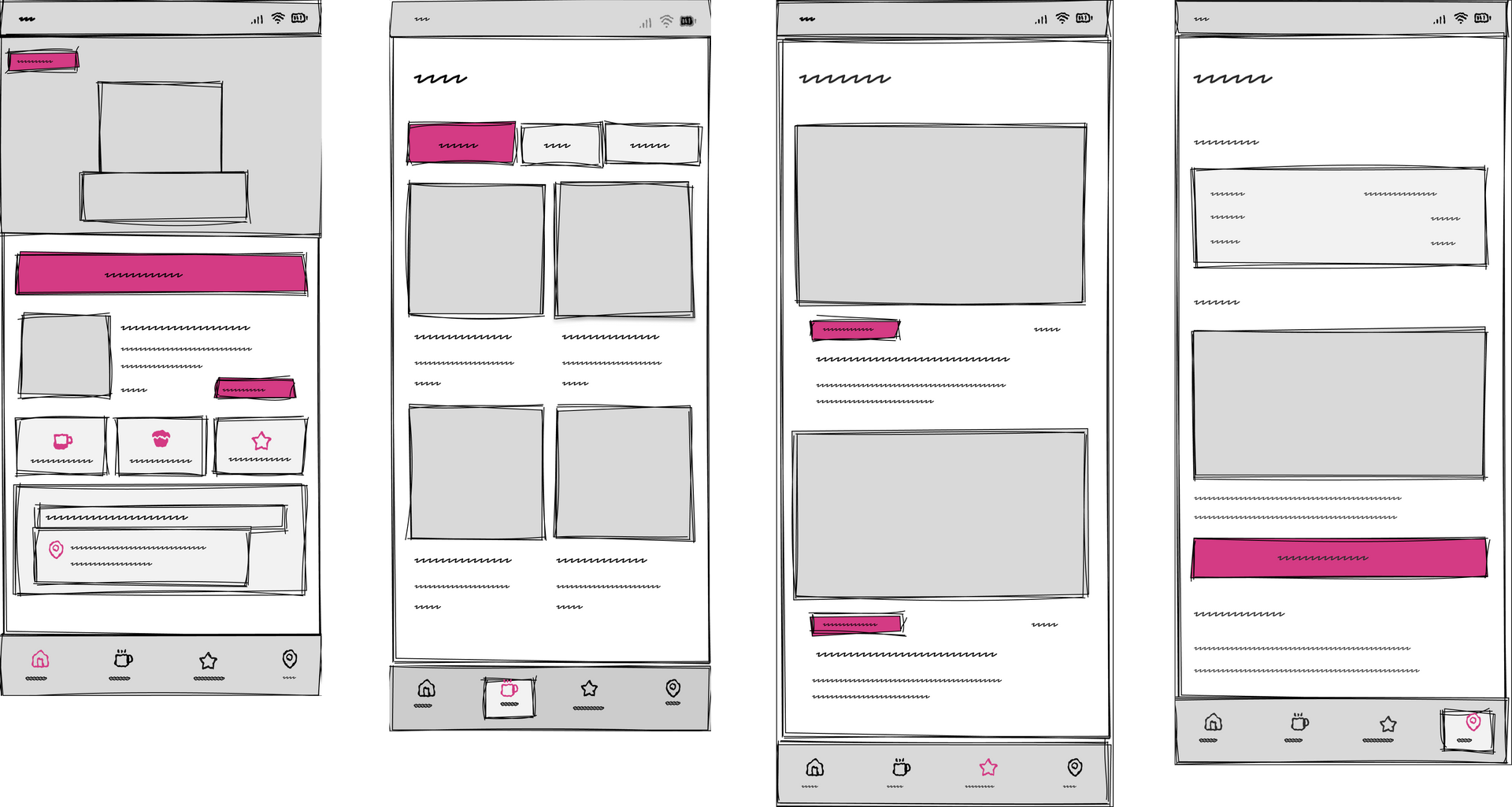
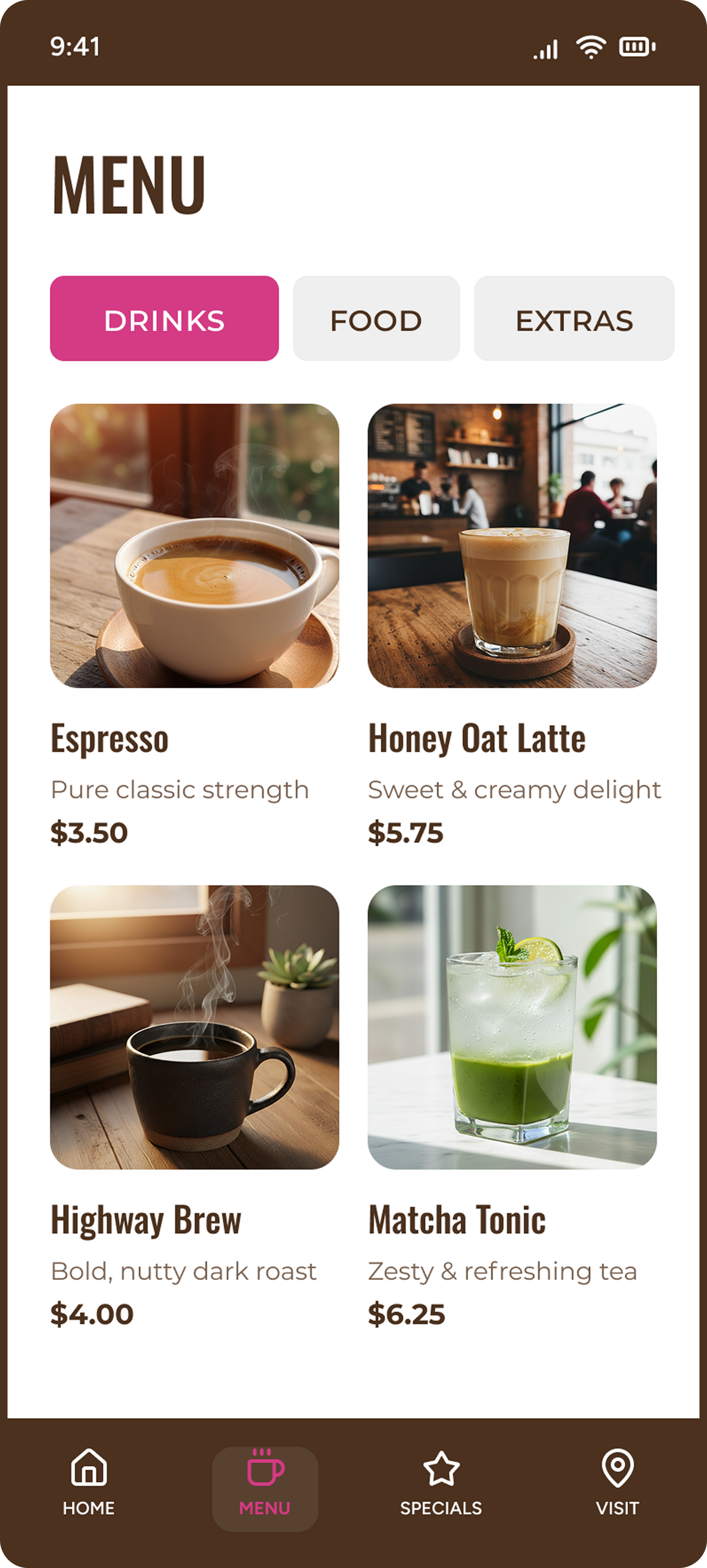
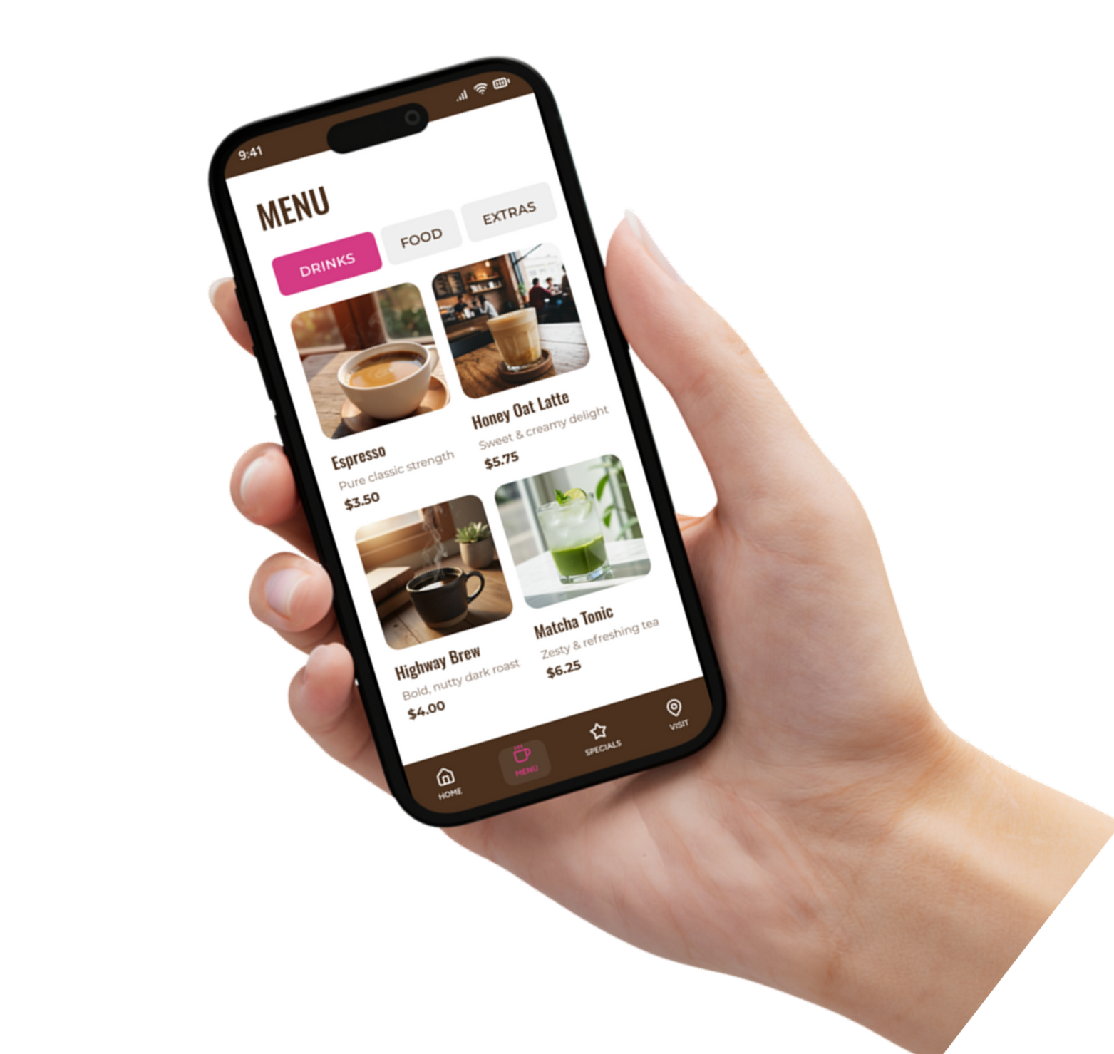
The branding answered the storefront. The phone was the next gap. I designed a mobile concept that puts the menu, hours, specials, and visit info in a customer's hand before they pull in, the same fast decision a driver makes at 55 mph, now answered on a screen.
Concept extension, not original client scope.
Home
Menu
Specials
Visit Details
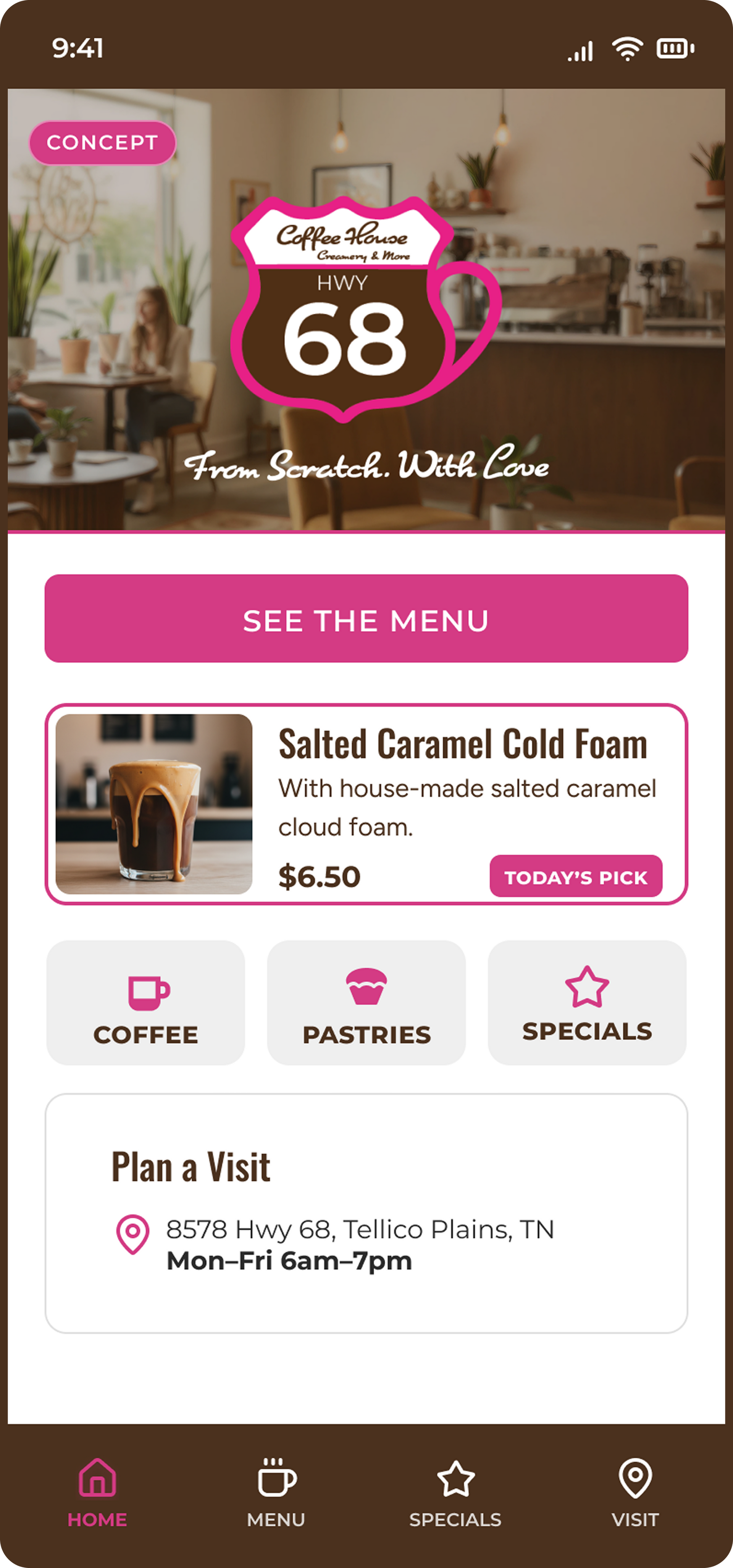
What's this place?
What can I order?
What's good today?
Where are they?
The Long Haul
What I learned
The real lesson wasn't "branding matters." It was that the budget and the owners' comfort level shaped every decision. A small budget pushed me toward a single reusable system rather than one-off pieces. Owners new to tech meant the work had to run without me. Mobile was the logical next step because the brand solved the storefront but left the phone, where customers now decide before they ever pull in.
What I'd test next
Whether drivers can find the menu and hours in under 20 seconds on the concept screens.
If the rewards and Bring-a-Friend cards actually drive repeat visits, measured, not assumed.
How well the owners can update the specials themselves without breaking the layout.