The Whole Bean
Identity & Branding
Visual Design Project
My Role
Logo Design
Collateral Design
Brand Strategy
Audience Research
Client
Fictional
Year
2024
Final Thoughts
The branding project for The Whole Bean showed how thoughtful design can create genuine community connections. And the fun collaboration between creative ideas and a passion for community laid the groundwork for a café that genuinely resonates with its patrons.
Project Overview
"Brewing Community Connections. One Cup at a Time"
The Whole Bean Coffee House, founded by a young couple, is a communal space for people to connect. It offers high-quality coffee and baked goods in an inviting atmosphere for all ages, fostering community relationships.
The goal of this project was to develop a brand identity, style guide, and collateral following an analysis of the target audience.
Sneak Peak
Design Process
Outcome
Project Overview
The Big Idea
The Whole Bean Coffee House, established by a young couple with a vision for creating a communal space where people can connect. It aims to be a warm gathering place where individuals can enjoy high-quality coffee and delicious baked goods. The goal is to provide an affordable yet inviting environment that caters to a diverse audience, from young adults to seniors, fostering relationships and interactions among community members.
The Cafe lives its mission statement:
"Brewing Community Connections.
One Cup at a Time"
The Goal
Create a brand identity appealing to a wide demographic and radiating the cafe’s values:
- Welcoming
- Down-to-earth
- Friendly
- Community-oriented
- Genuine
- High-quality
The Deliverables
The final design deliverables of the project included:
- Color Palette
- Typography Scale
- Logo Design
- Icon Pairs
- Collection of Brand Images
- Brand Style Guide
Key Objectives
My approach to this branding design project included the following key components:
- Brand Strategy
Collaborated closely with the owners to clarify
the brand’s vision, mission, and core values.
- Audience Research
Created detailed personas to better understand
our target audience’s preferences and needs.
- Visual Identity Design
Developed a compelling visual language that
included colors, typography, logos, and imagery.
- Collateral Design
Designed practical branding elements for
merchandise, packaging, and digital platforms.
- Brand Style Guide
Produced an easy-to-use manual to maintain
visual brand consistency across all touchpoints
and materials.
Sneak Peak
Key Learnings
- Audience Engagement: Really digging into who the audience is leads to smarter branding choices.
- Creative Freedom: Letting design evolve can lead to surprising and aligned results.
- Consistency is Essential: A clear style guide means the brand stays strong as it grows.

Design Process
My design process typically starts with researching what is already out there. I like to get an idea of popular branding and what similar establishments in the area use, so I can avoid spending time designing something too similar. Also, I like to look at branding in other countries, trying to get as much creative inspiration as possible.
In this class project case, I sat in a coffee house to work, enjoy some good coffee, and gather ideas about the target audience. To make my design process most efficient, I like to use AI to help me create personas and to structure my thoughts into clear, informative, and correct text. The images, typefaces, and colors I choose for the project are, of course, based on the research and given criteria, but also driven by my instinct and eye for aesthetics.
Working from home, I like to set the right vibe by choosing a Spotify playlist that matches the vibe I want to achieve. In the design process of The Whole Bean, I decided on cozy coffee shop jazz.
Step 1: Strategy & Research
I started by asking strategic but straightforward questions:
- What is the owners' vision for their café?
- Who are their customers, and what do they want?
- What sets The Whole Bean apart from nearby options?

Personas
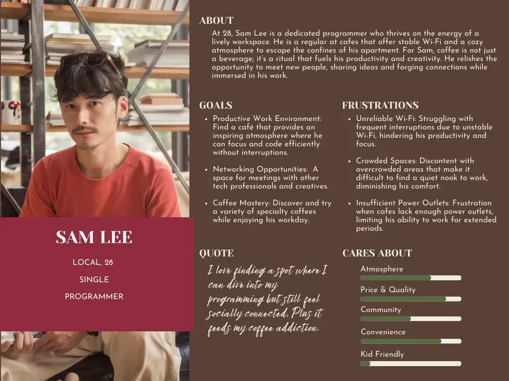
In order to effectively design for the target audience, I developed three key personas that represent various customers of The Whole Bean, with a focus on individuals aged 30-60.
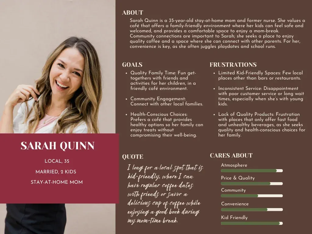
The Social Parent
35, a mom who enjoys casual meetups with fellow parents to chat, looking for a welcoming atmosphere while keeping an eye on her children.
The Remote Professional
28, a freelancer who loves a lively atmosphere with a comfortable space to work and reliable Wi-Fi.
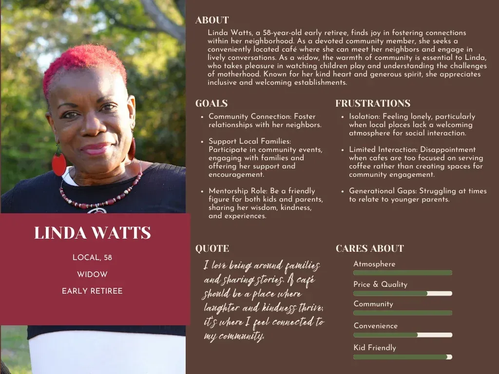
The Casual Visitor
58, a retiree who is looking for a local spot to enjoy quality coffee and pastries without traveling into the city.
Competetive Analysis
My research revealed a notable gap in the market. While several excellent coffee shops exist in the city, none prioritize building community connections in the outer part communities.
Step 2: Logo & Visual Branding
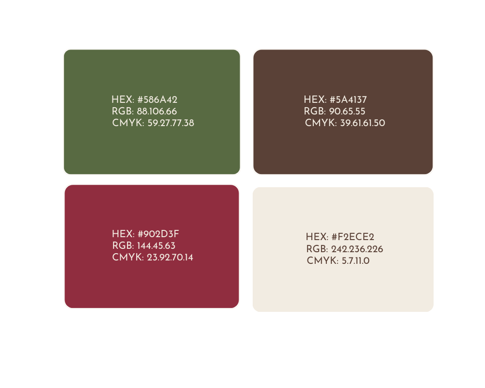
Color Palette
Inspired by a photo of the coffee bean flower, I chose a muted, earthy green to serve as the brand's primary color. This choice was strategic; the green tone evokes the natural, organic origins of coffee beans, complemented by a secondary color of a roasted coffee bean, a warm brown, and an accent of cozy red rounded with a contrasting soft white to emphasize quality and nature.

Typography
Inspired by a photo of the coffee bean flower, I chose a muted, earthy green to serve as the brand's primary color. This choice was strategic; the green tone evokes the natural, organic origins of coffee beans, complemented by a secondary color of a roasted coffee bean, a warm brown, and an accent of cozy red rounded with a contrasting soft white to emphasize quality and nature.
Yeseva One 56pt
Josefin Sans Normal 36pt
Josefin Sans Light 18pt
Josefin Sans Normal 16pt
Josefin Sans Light 16pt
Logo & Icons
The primary objective for The Whole Bean Coffee House logo was to create a brand identity that instantly conveys warmth, quality, and a sense of community. The desired aesthetic was a blend of timeless tradition and modern approachability, representing the coffee house as a welcoming, high-quality neighborhood destination.
At the heart of the logo is a simple, universally recognized icon of a steaming coffee cup. Its clean lines make it easily identifiable, and the rising steam adds a subtle touch of warmth and freshness, alluding to the delightful sensory experience of a great cup of coffee.
All elements were carefully centered and balanced within the oval to create a harmonious and uncluttered final mark. The result is a logo that feels both professional and personable. It successfully communicates the core values of The Whole Bean Coffee House: quality, tradition, and a warm welcome, in a single, memorable design.
Imagery
I collected high-quality images illustrating the café’s owners, staff, atmosphere, and product offerings for use across marketing assets, which evoke feelings of community and comfort, ensuring the imagery aligns with the brand's personality and can be leveraged across promotional materials.
Step 3: Brand Style Guide
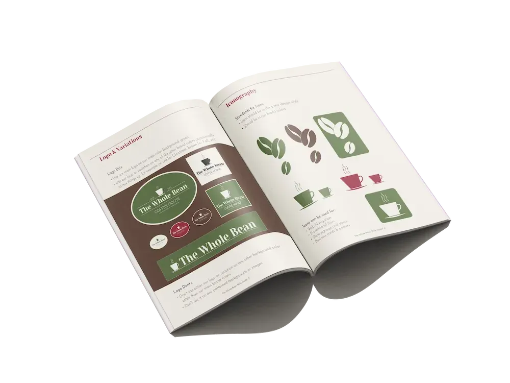
Next, I created a comprehensive brand style guide that outlines the correct usage of fonts, colors, logos, and imagery, providing the owners with an essential tool for maintaining brand consistency.
Step 4: Marketing Materials
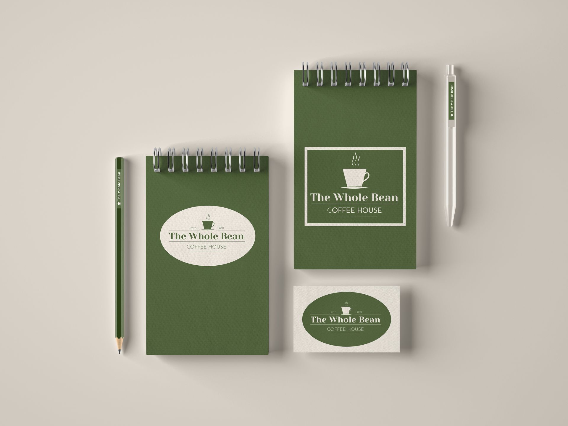
After my designs were iterated and approved, I created mock-ups to help visualize the branding on items like coffee cups, bags, merchandise, and digital platforms.

Final Thoughts
Next Steps
What’s next for The Whole Bean Project?
I’m working on a user-friendly website and app to extend online branding. This will include online ordering and event updates, further establishing the café as a community hub.
Key Learnings
- Audience Engagement: Really digging into who the audience is leads to smarter branding choices.
- Creative Freedom: Letting design evolve can lead to surprising and aligned results.
- Consistency is Essential: A clear style guide means the brand stays strong as it grows.
In a Nutshell...
The branding project for The Whole Bean showed how thoughtful design can create genuine community connections. And the fun collaboration between creative ideas and a passion for community laid the groundwork for a café that genuinely resonates with its patrons.
